

ABC Supply Rebrand
Fall 2020
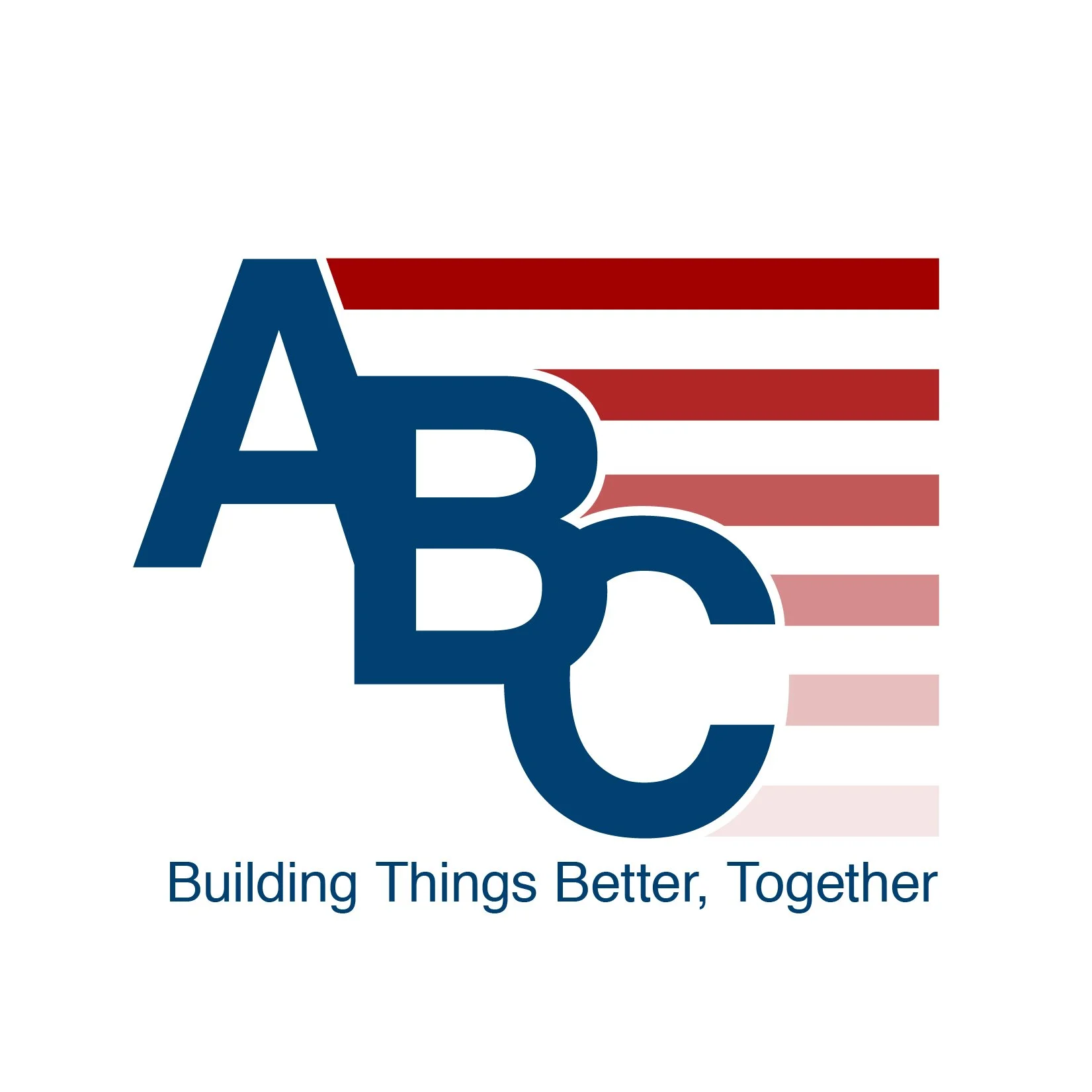
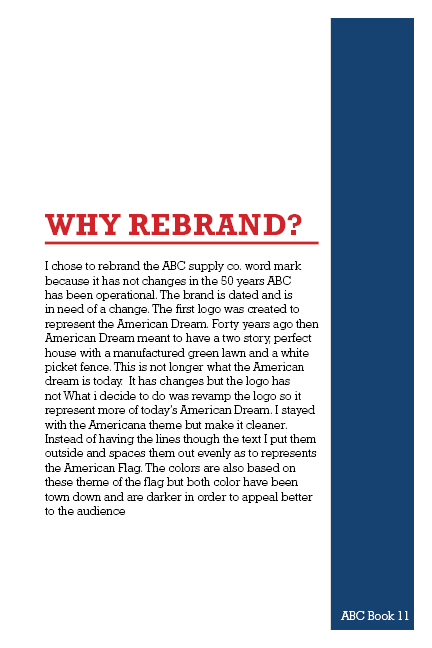
This was a case study for a rebranding of a company I thought needed a new version of its logo. The goal was to redesign the logo while still keeping the memory of the original design in mind. For this design, I decided to go back to my hometown of Beloit, WI. The biggest company there is ABC Supply company. The owner of the company has a huge influence on the going on of Beloit. She has done a lot to change Beloit but one thing that has not changed in the 50 years of the company is the logo. My goal was to update it and then write a new brand book for the updated logo.

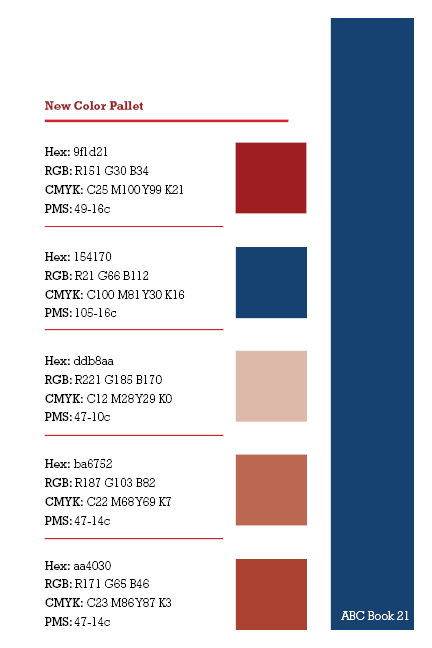
The original has an uneven spacing of white lines within the logo. It contains an off slice to the C as well as an odd location for the top blue extension line. The colors are muted and the type is a very generic look to it. Because of this and the fact that it has not been updated in 50 years, I felt like this was a perfect logo to rebrand. ABC's goal was to create the American dream through the shipment of building supplies that they provide. I decided to keep the color scheme but tweak it a little bit to make it more of an improvement. I updated the placement of the letterform which could then be backed by different versions of the straight lines to hint more back to the American flag.


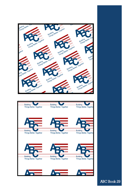


After the logo was redesigned I created a 36-page brand book of how I created the new brand, how it should be used and not used, and what the brand could not be accompanied by. Some of the pages are shown above and along with those the book also held the Vision and Mission statement for the company, mockups of the logo on trucks or t-shirts, and colors and typefaces to be used with the logo and other brand elements.